¶ Overview
SUMO24 comes with exciting new simulation features that can be used for detailed analysis and optimization of plant design and operation.
Users of earlier version of SUMO will notice a fundamental change when switching over to the Simulate tab: as soon as it is activated, the tab splits horizontally into two parts (alike to the Inputs tab). The default selection is the upper part, labeled as Simulate: this one bears the same functionality as in the earlier versions of SUMO, enabling the user to run simulations of the previously configured project, with one new feature, the multiple scenario runs (discussed below). The lower part is labeled as Advanced, and offers the possibility to conduct scenario analysis or optimization (both of these features require at least one parameter to be selected for advanced analysis on the Inputs or Model tab, see in detail below).
Another new advanced feature is related to the Outputs tab: if you are using 1D layered clarifier model in your project, you can now perform a state point analysis quick and simple, by means of the SPA chart functionality.
A simulation depends on the input data and its dynamic behavior: from SUMO24 version date and time based dynamic inputs are possible. Look at the Date and time based dynamic input chapter below.
¶ Multiple scenario runs
This is a feature on the simple Simulate mode, yet a novelty for users of earlier SUMO versions, where you could only run the currently active scenario tab and running another scenario required a separate simulation, following the activation of that other tab. In SUMO24, there is a checkbox for each scenario tab, allowing them to be selected for simulation one-by-one or in any desired combination. If more than one scenarios are checked, all of them will be run with the conditions set up in the simulation control panel, one after another, and outputs will be plotted/reported for all runs.
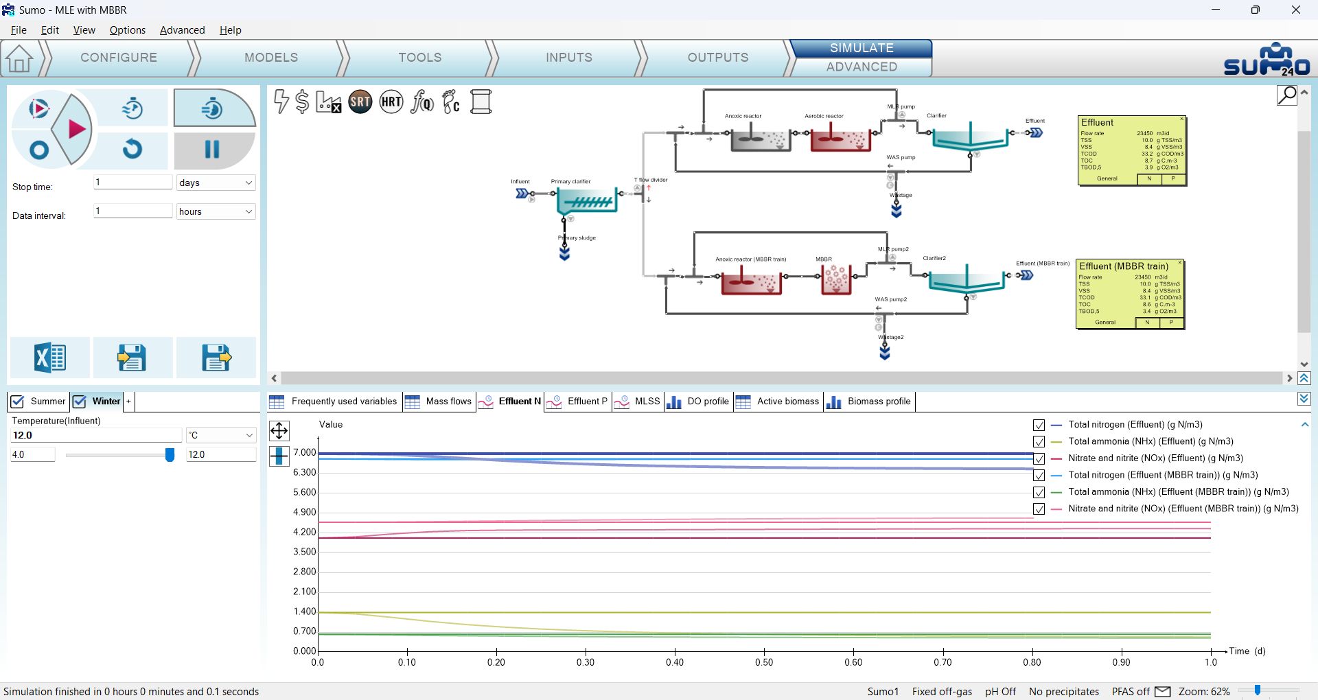
To see this feature in action, let us open the “MLE with MBBR” example from the example library (welcome screen, Biofilm tab) and move straight to the Simulate tab. In the bottom left window pane you will see two predefined scenarios (named Summer and Winter), make sure that both of them are checked (Figure 3.2.1).
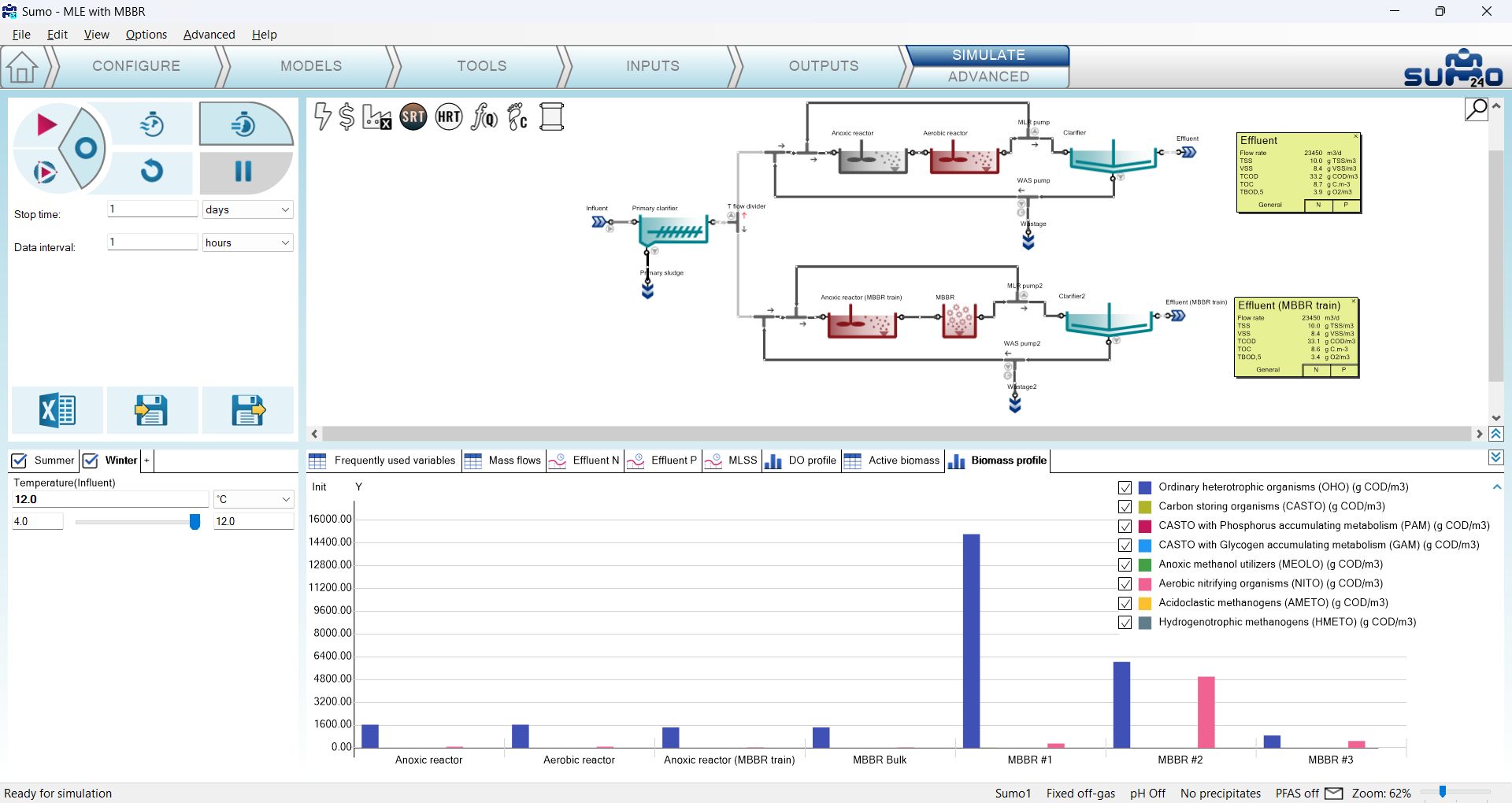
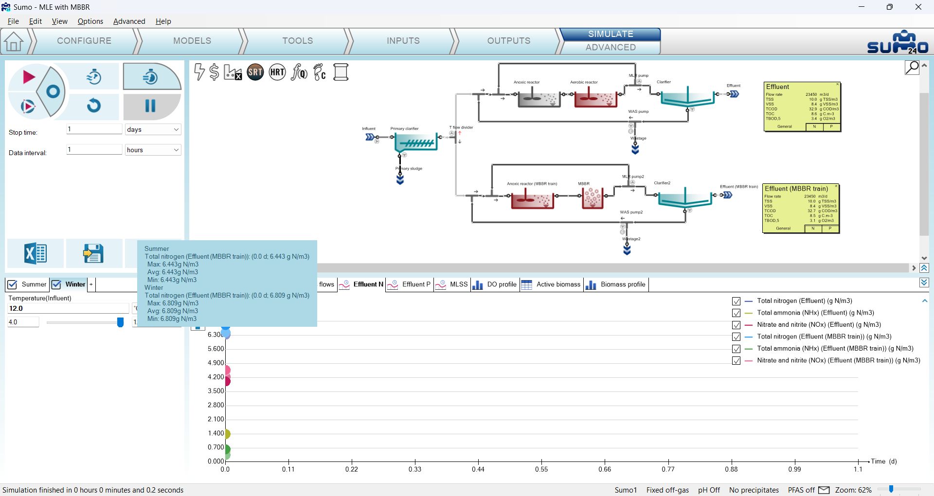
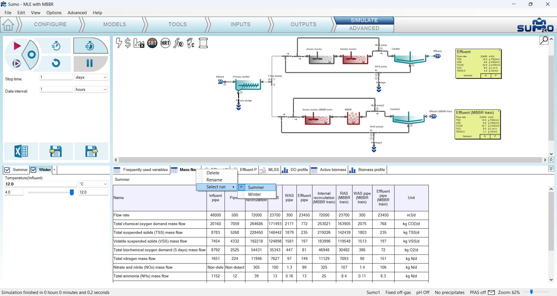
Launch a Steady-state simulation and you will see that two consecutive runs are performed (the order is defined by the order of the scenario tabs, from left to right). On timecharts, the results of both scenarios will be shown with slightly different respective colors (Figure 3.2.2), while for tables, barcharts and piecharts, you can select which scenario's result you would like to see, by right-clicking on the name of the respective output, choosing “Select run” from the menu, and selecting the desired scenario from the flyout list (Figure 3.2.3) - the actual selection will be applied to all outputs. In the latter case, please note that updating the results may take a while.
As the next exercise, perform a 1-day Dynamic run from Steady-state. Figure 3.2.4 illustrates how the results of both scenarios are plotted on the same timechart. Other output types work the same way as described above, switching between the scenarios.
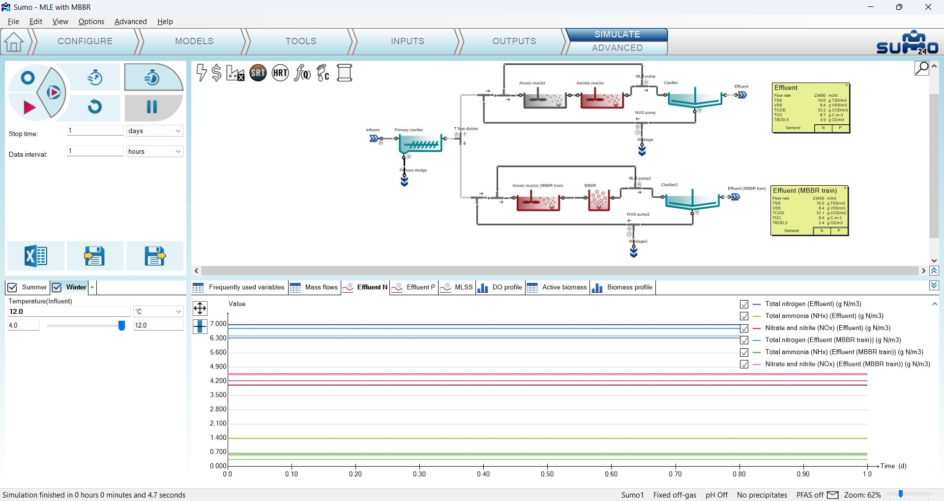
As the last exercise, launch a 1-day Dynamic run from the current state. Figure 3.2.5 illustrates the results plotted on the Effluent N timechart. On the graphs you will see that the initial conditions for both scenarios were the steady-state conditions of the Winter scenario, as it was the result of the last simulation before launching this one. While the graphs of the Winter scenario maintain the initial values, those of the Summer scenario start to diverge from them, according to the parameters set in the scenario. This goal of this exercise was to highlight the importance of initial conditions when running multiple scenarios in a single simulation.
¶ Scenario analysis
This is a brand new feature in SUMO24, available from the Advanced subtab of the Simulate tab. It is similar to the multiple scenario runs functionality regarding that it performs a batch of simulations with various parameter settings, but it works in a different way. The aim of scenario analysis is to investigate the effect of varying one or more parameter(s) within a given range, as opposed to comparing fixed parameter combinations of two or more scenarios (which is the case for multiple scenario runs). With this functionality, you can perform sensitivity analysis for a model with only a few clicks - no need to set up multiple runs and export results one by one manually.
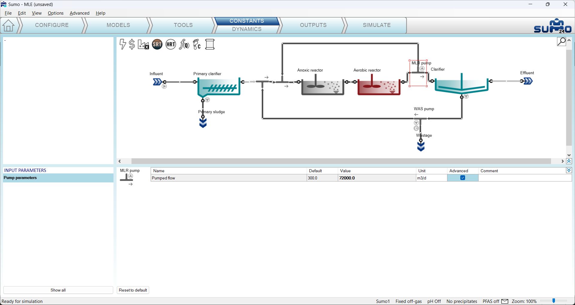
To see this feature in action, let us open the “MLE” example from the example library (welcome screen, Nutrient removal tab) and move to the Inputs tab. On the layout, select the MLR pump flow divider unit (located after the aerobic reactor) and click the checkbox for the Advanced column of the Pumped flow parameter (Figure 3.3.1). Similarly, also select the Temperature parameter of the Influent (listed in the last row of the Influent specifications input parameter table) for advanced simulation.
Now move over to the Simulate tab and click its Advanced subtab. You will notice that the appearance of the bottom left window pane, where the scenarios are placed, changed a bit: the scenario checkbox turned into a magnifying glass symbol, and just beneath the name tab of the scenario, a dropdown menu appeared with two options: Analyze (default choice) and Optimize. Leave this on Analyze and review the two parameters available for scenario analysis: on the left side of their current values, you will notice that a checkbox appeared for each, by default unchecked.
¶ Single-parameter scenario analysis
Having prepared the model as described above, check the checkbox for Pumped flow (MLR pump) and you will see that the parameter value slider will turn into a text box available for user input, by default showing a value of '3' (Figure 3.3.2).
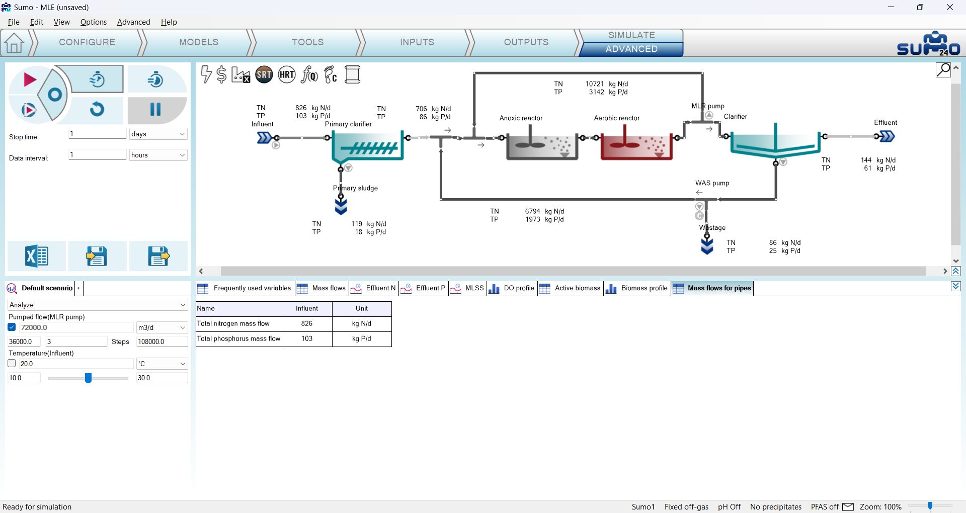
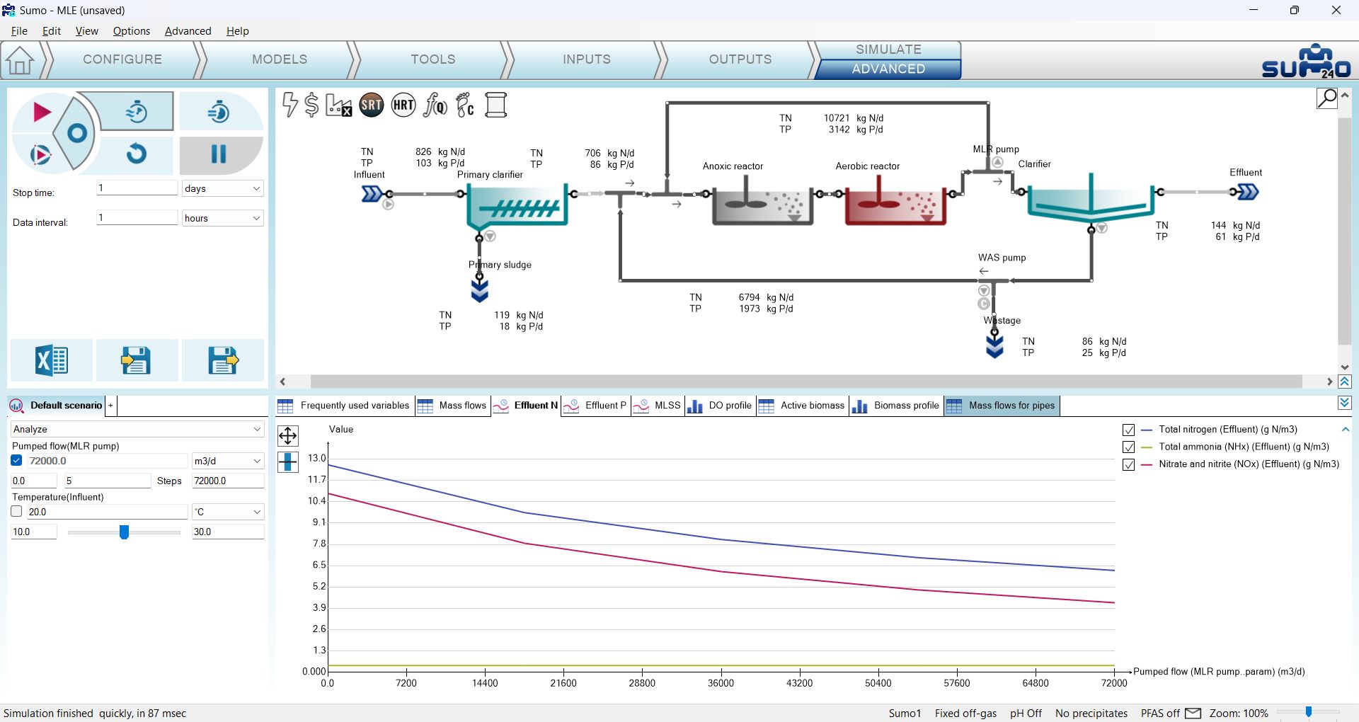
The role of this input box is to define the number of equal steps for the scenario analysis runs of the selected parameter, which will start from the low end value (left side input box) and finish with the high end value (right side input box). The number of steps include the low and high end value as well, whose values of course can be modified, too. Let us update the settings so that the scenario analysis will investigate the MLR pumped flow from 0 to 72000 m3/d in 5 steps (Figure 3.3.3). Please note that for the other parameter (Temperature), only its actual value (20 °C) will be considered for now, because it is currently not selected for scenario analysis (the checkbox is unchecked). We will involve this parameter later, in a subsequent part of our exercise, when demonstrating multiparameter scenario analysis.

In the next step, perform a Steady-state simulation and switch over to the Effluent N timechart. During the simulation, five scenarios will be run with the prescribed settings, one after another, and outputs will be plotted/reported for all runs. For steady-state runs, the timechart switches into an XY chart, with the investigated parameter on the X axis and the results of the simulation for the various scenario runs on the Y axis (Figure 3.3.4). In this case we will see how the effluent NOx and TN decreases with increasing MLR pump flow from 0 to 72000 m3/d, in 5 steps (move the mouse cursor over the graphs to take a reading of the exact values).
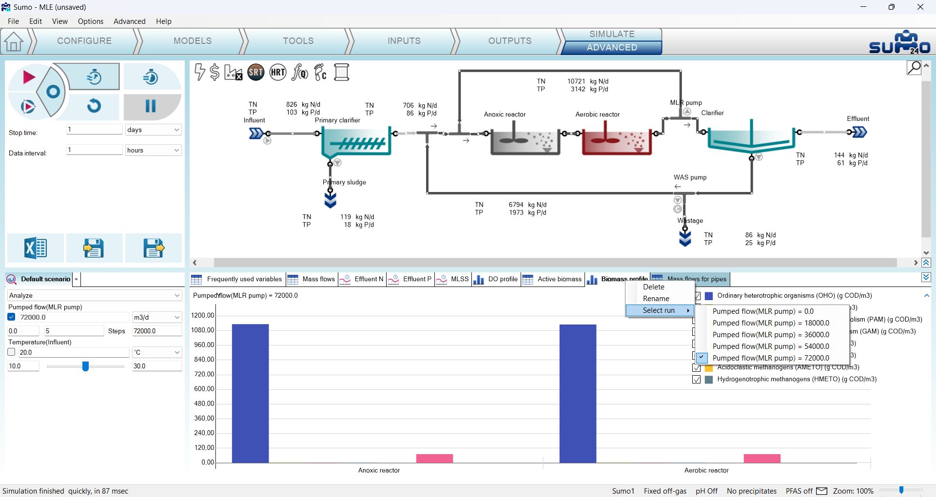
For tables, barcharts and piecharts, you can select which run's result you would like to see, by right-clicking on the name of the respective output, choosing “Select run” from the menu, and selecting the desired scenario run from the flyout list (Figure 3.3.5) - the actual selection will be applied to all outputs. In the latter case, please note that updating the results may take a while.
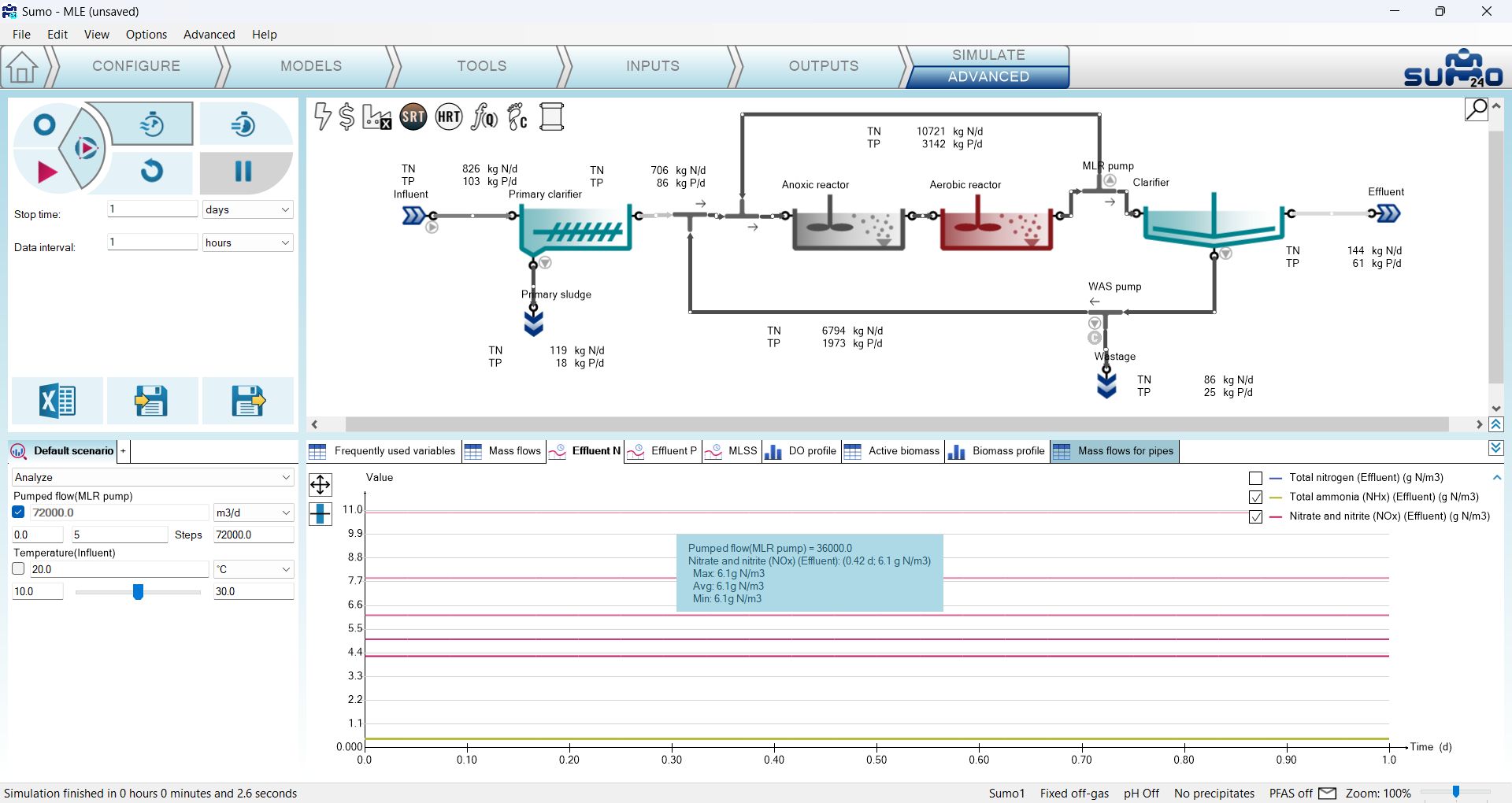
As the next exercise, perform a 1-day Dynamic run from Steady-state. Figure 3.3.6 illustrates how the results of the five runs are plotted on the Effluent N timechart, which remains a timechart when dynamic mode is involved in the simulation (note that Total nitrogen was hidden from the graphs by unchecking it on the chart legend). Hovering the mouse above the graphs will reveal which run they belong to, along with the exact value (if the graphs are close to each other - like for ammonia in this case - their information will appear together in the blue popup window). Other output types work the same way as described above, switching between the runs.
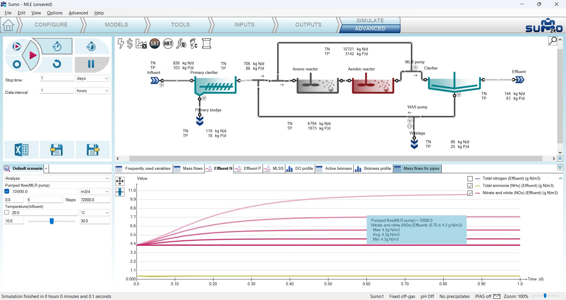
Now, launch a 1-day Dynamic run from the current state. Figure 3.3.7 illustrates the results plotted on the Effluent N timechart (note that Total nitrogen is again, hidden, for clarity). On the graphs you will see that the initial conditions for all runs were the steady-state conditions of the run with MLR pumping set to 72000 m3/d, as it was the result of the last simulation before launching this one. While the NOx graph of the MLR pumping with 72000 m3/d scenario maintains its initial value, those of the other runs start to diverge from it, according to the setup of the parameter scenario analysis (note that there are also five distinct graphs for ammonia as well, however, the variations in this scenario analysis don't have a visible effect on this variable). This goal of this exercise was to highlight the importance of initial conditions when running scenario analysis in Dynamic mode.
¶ Multiparameter scenario analysis
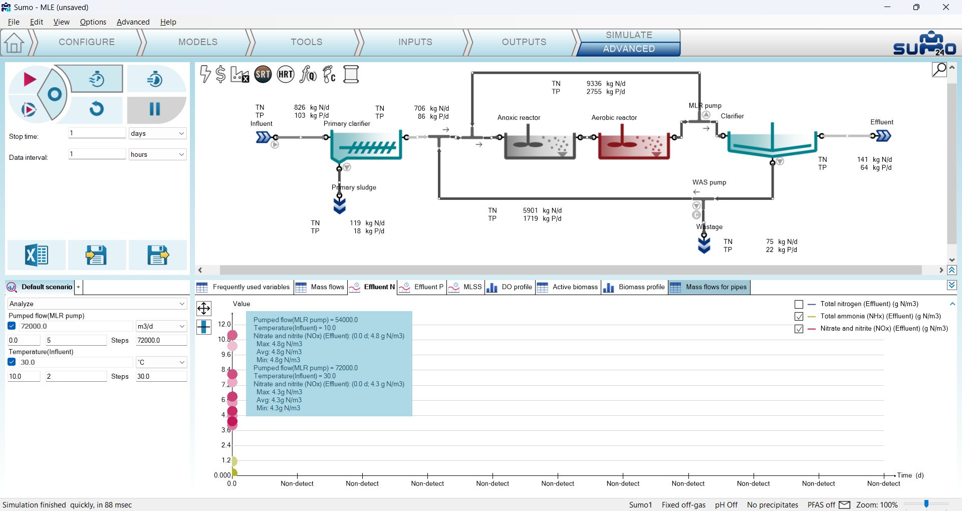
The scenario analysis functionality is not limited to one parameter only. Continue the previous exercise with enabling the checkbox for the Temperature (Influent) parameter as well, and set it up so that the low end value is 10, the number of steps is 2 and the high end value is 30 (Figure 3.3.8). By doing so, the number of runs for the new scenario analysis setup will be doubled, as five stages of MLR pump flow settings will be simulated for two stages of temperature settings. Running a Steady-state simulation will update the Effluent N timechart as shown on Figure 3.3.8 (if more than one parameters are selected for scenario analysis, the timechart remains a timechart and steady-state values for all runs will be presented by circles, as in simple simulations - exact values can be read by hovering the mouse over the results). Showing the results on other output types works the same way as with single-parameter scenario analysis.
Now increase the stop time to 30 days and perform a Dynamic simulation. Figure 3.3.9 presents the resulting graphs on the Effluent N timechart, two sets (one for each temperature) per plotted variable, for the five pump setting variations. Again, you can confirm that the initial condition for starting each of the 10 runs was the steady-state of MLR pumping by 72000 m3/d and influent temperature of 30 °C, as it was the result of the last previous simulation. You can also see that the investigated temperature range had visible impact on effluent ammonia results, unlike the MLR pump flow range.
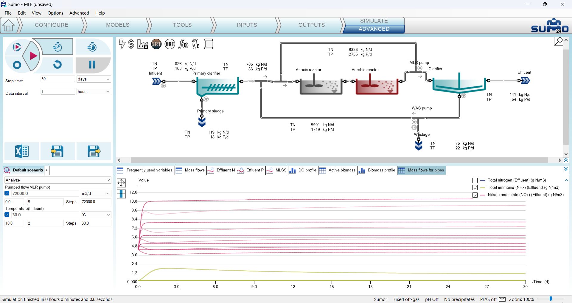
The number of parameters considered for a scenario analysis and the number of steps per parameter is not limited. However, given the rapid increase in the runs required per analysis as you extend the scope, coupled with the limitation of charting possibilities (number of dimensions, number of similar color lines on a graph) may pose difficulties regarding simulation time and output readability. Nevertheless, don't forget that the data output from all runs will be saved in a tabular format if you export a report after the simulation, available for further processing with other tools, if needed.
¶ Optimization
This is a brand new functionality in SUMO24, available from the Advanced subtab of the Simulate tab. To see this feature in action, let us open the “Tutorial Plant 2 with Energy” example from the example library (welcome screen, Tutorials tab) and set up an optimization example by following the steps below.
On the Configure tab, change the underflow specification of the Primary to Sludge flow (Figure 3.4.1). Then, on the Inputs tab, mark the checkbox in the Advanced column for the following parameters of the respective process units:
- DO setpoint in the Aerobic reactor (Aeration settings input parameter table)
- Pumped flow in the WAS pump (Pump parameters input parameter table)
- Pumped flow in the NMLR pump (Pump parameters input parameter table)
- Sludge flow in the Primary (Process settings input parameter table)
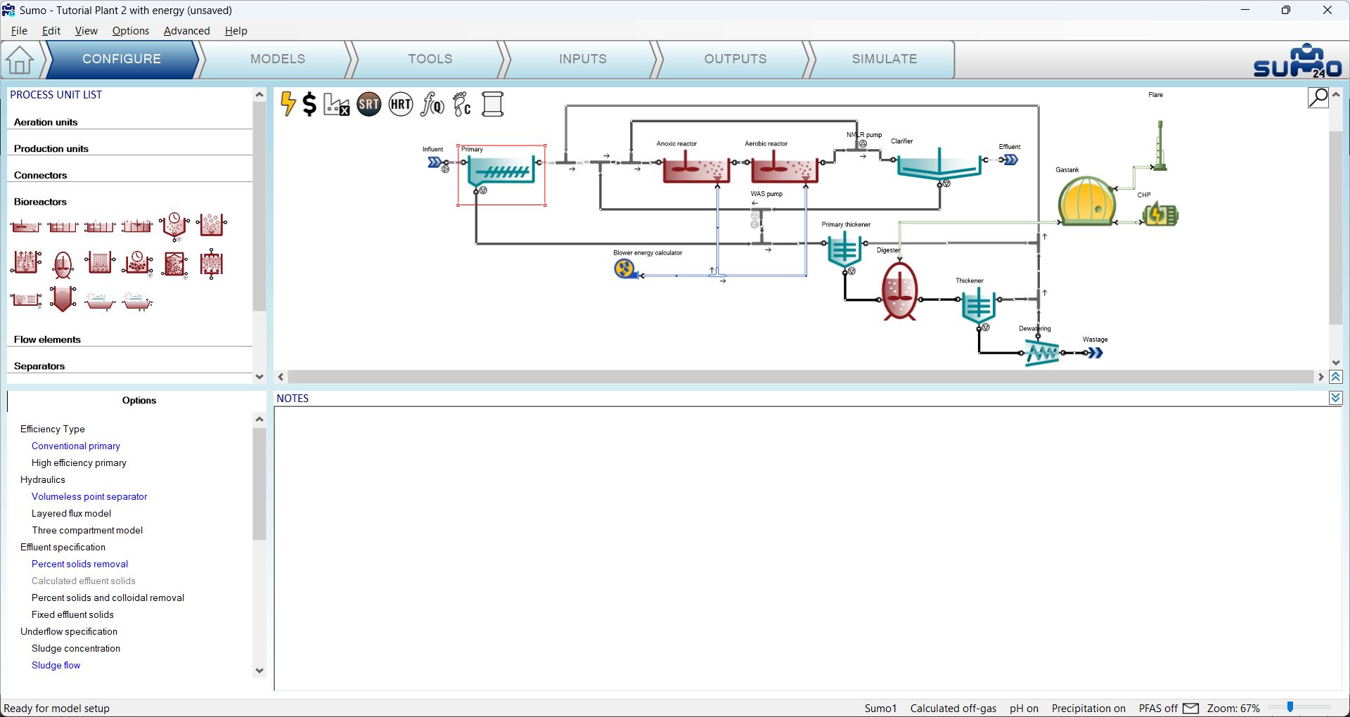
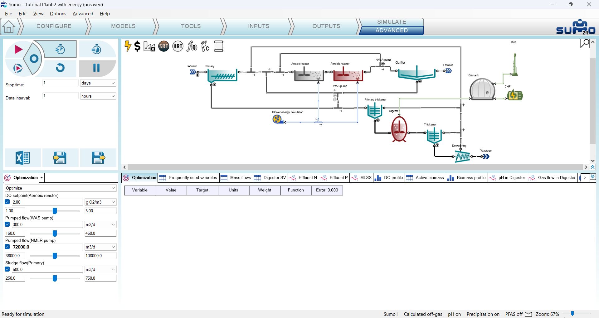
Now move over to the Simulate tab and click its Advanced subtab. You will notice that the appearance of the bottom left window pane, where the scenarios are placed, changed a bit: the scenario checkbox turned into a magnifying glass symbol, and just beneath the name tab of the scenario, a dropdown menu appeared with two options: Analyze (default choice) and Optimize. The parameters that you have previously made available for advanced simulations are shortlisted below, with a checkbox for each of them (on the left side of their current values), by default unchecked. Check all four, then change the scenario's name from “Default scenario” to “Optimization” and then switch the dropdown menu to Optimize. This will automatically add an optimization setup table to the foremost place of the outputs (bottom right window pane). Review the above settings on Figure 3.4.2.
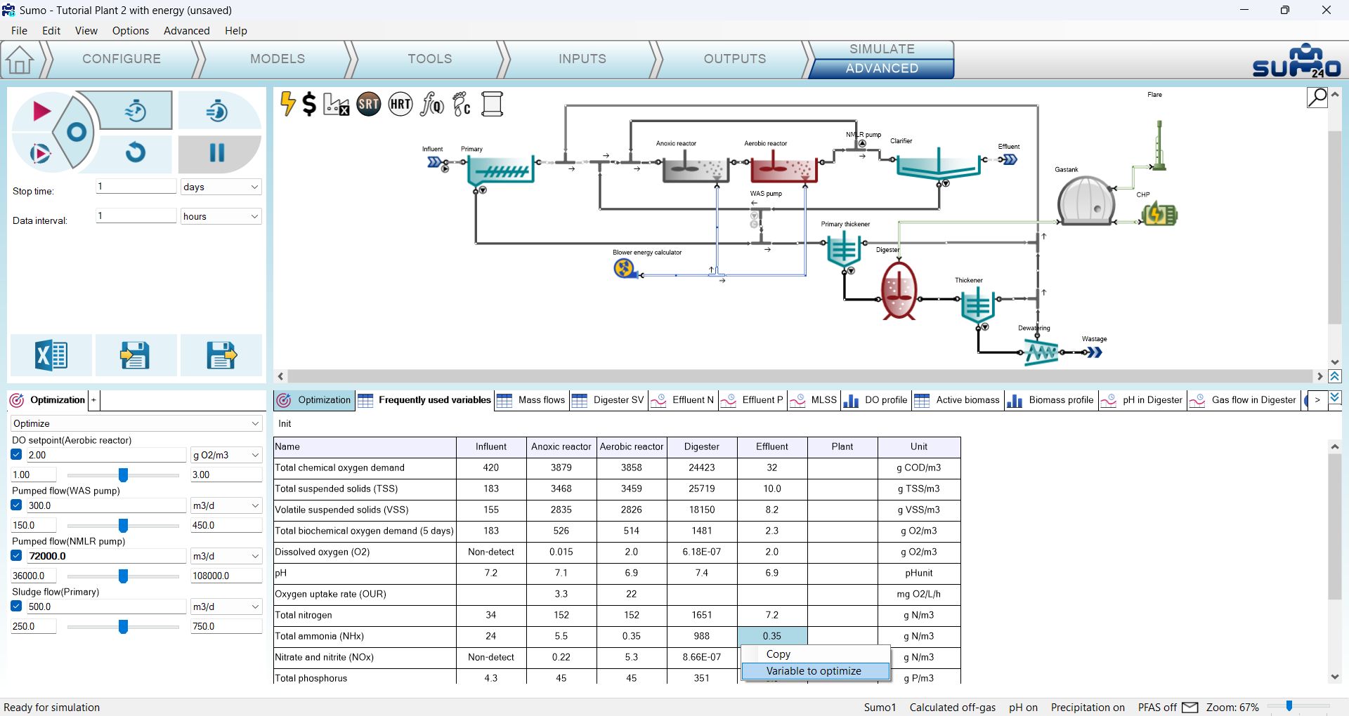
You can now add variable(s) to be the target(s) of the optimization from any of the existing output tables or charts, by right-clicking on a table cell or a graph and choosing the “Variable to optimize” item in the flyout menu. Pick Total ammonia (NHx) and Nitrate and nitrite (NOx) from the Effluent column of the Frequently used variables table and Self sufficiency from the Energy center column of the Electric energy balance table to be the target variables for this optimization exercise (Figure 3.4.3).
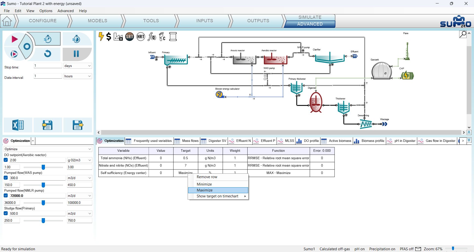
Move back to the optimization setup table and as a next step, set the target value(s) to the variable(s) to be optimized, by double-clicking the respective cell in the Target column of the table and entering a value, or alternatively, by right-clicking on this cell and choosing either the maximize or minimize options (e.g. for plant energy self sufficiency or cost, respectively). In our example, we will set 0.5 g N/m3 as the target for ammonia (Figure 3.4.4), 7 g N/m3 as the target for nitrate+nitrite and Maximize for self sufficiency (Figure 3.4.5).

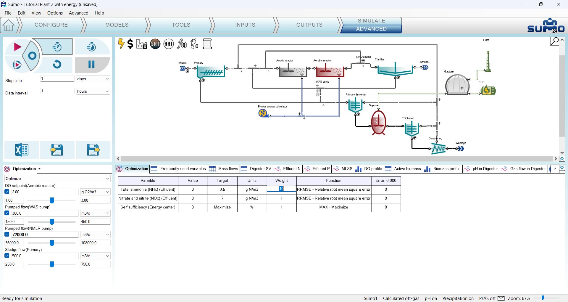
It is now time to review the values of the Weight column of the optimization setup table. By default, all rows have the same weight, however, for tuning the optimization, in order to bring the scale of error calculations to a comparable level, the weights should be adjusted to balance out the differences in the order of magnitude of the variables (e.g. if working with TSS and ammonia as variables to be optimized, the former is usually on the 103 scale, the latter is 1...10-1 scale, so the weight of the latter should be increased if you'd want the optimizer to assign the same importance to both in terms of error calcs). In our example, there's one order of magnitude difference in the ammonia vs the nitrate+nitrite variables, so let us increase the weight of the former to 10, by double-clicking the respective cell and entering this value (Figure 3.4.6).
Make sure that all the parameters you wish to be adjusted by the optimizer are selected in the scenario (and all of those which you would want to exclude are unchecked - in our example we don't have such) and review the values automatically determined for the lower and upper bounds (shown on the left and right side of the sliders for each parameter), as the optimizer will search a niche in the "hyperspace" that is defined by them. If the optimizer finds a solution very close to one of the bounds, it is a good idea to extend it and rerun the optimization.
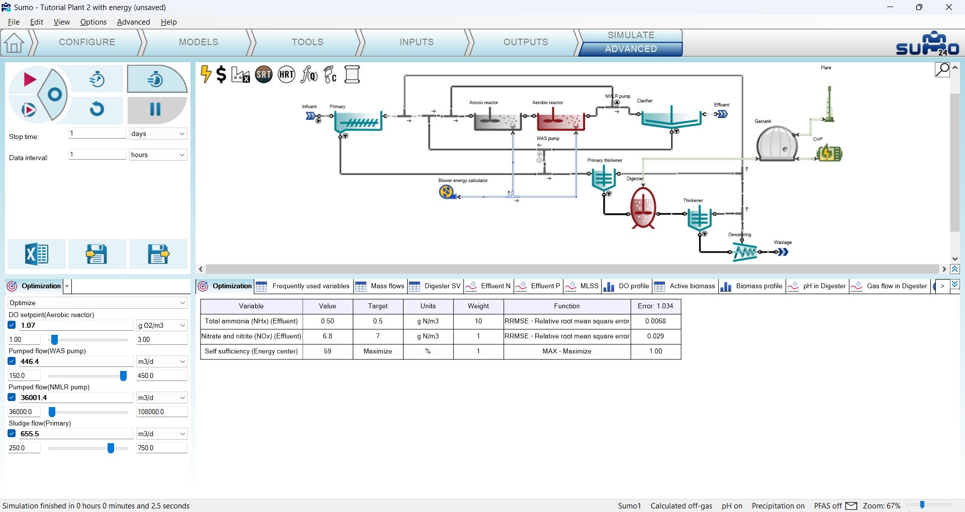
Finally, switch over to the Accurate solver setting on the simulation control panel (the example we opened is already in steady-state and we are just fine tuning a few parameters, so this solver setting is more favorable in our case) and hit the Calculate Steady-state button. The optimizer will start working, doing a series of steady-state simulations (you can follow the number of iterations in the status bar, at the bottom of the screen), each time updating the parameters in the scenario, and stopping with the one that it finds the best (Figure 3.4.7).
It is also possible to optimize a dynamic run to a time series (e.g. measured values) that is already plotted on one of the timecharts, as demoed by the Autotuning controller example that can be found among the Advanced tab of the examples on the Welcome screen.
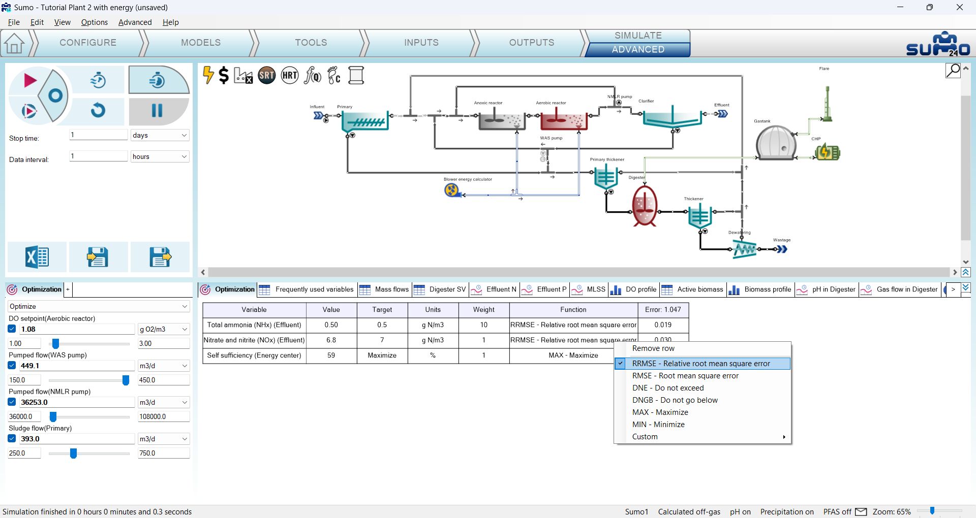
Very advanced users might as well modify the type of error calculations used by the optimizer. The list of available methods can be revealed by right-clicking the cells in the Function column of the optimization setup table, which will open a flyout menu (Fig. 3.4.8).
¶ Save and Load plant conditions
The purpose of the Save/Load plant conditions buttons are to allow the user to set initial conditions flexibly for the next simulation. The Reset button set the initial conditions for the next simulation stored under each process units' Initial concentrations. To use a different set of values, the Save plant conditions can be used to store and load back later as new initials concentrations. The functionality is plantwide and is performed for the system state (all reactors' every initial concentrations are stored) and can't be separated for specific process units.
There are various reasons the functionality proves useful:
- long runtime to get to steady-state - worth saving and loading back
- solver problems end up in unstable conditions - better to start from new initials (other than using Reset)
- help the analyze functionality: save and load condition for the new set of analyze runs
The steps are straightforward:
1. Run simulation to the desired state.
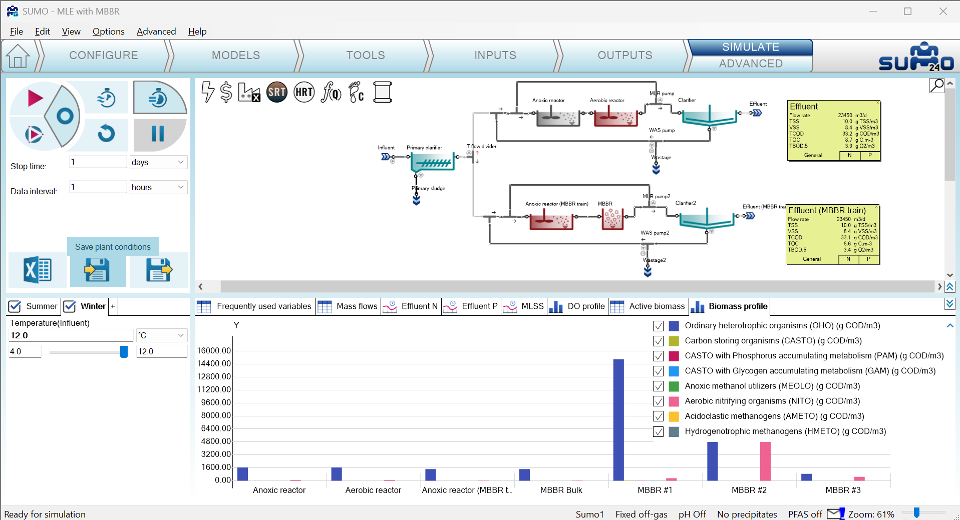
2. Click Save plant conditions on the simulation control panel (top left on the Simulate tab):
3. At the file dialog, give a proper filename, specific to the run for the simulation result:
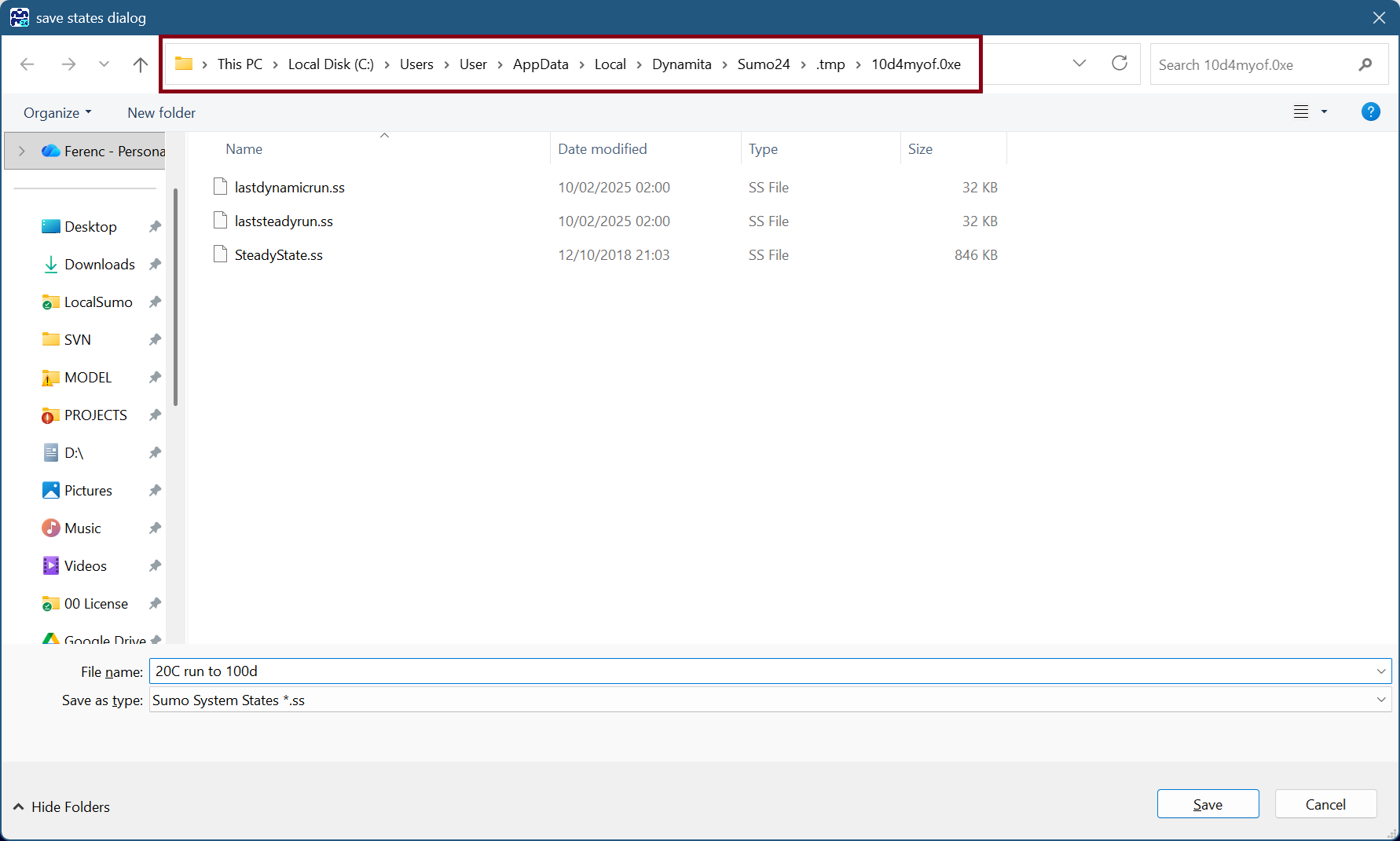
The path should be kept as is highlighted on Figure 3.5.2 thus the saved conditions will be part of the Sumo project save and you can use it later as well - similarly to any Excel tools or attachments under the Notes section. The path is the same where you can get from the View | Directories | Project directory menu item.
4. Repeat steps one to three. There is no limit on the number of saved states.
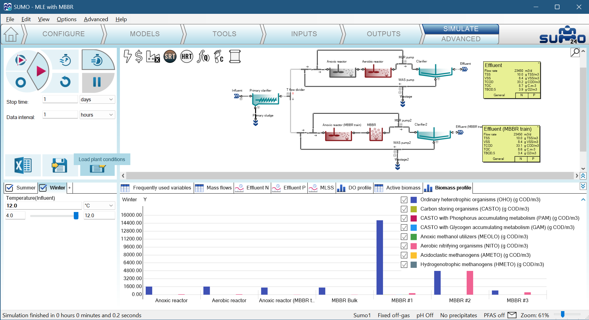
5. To load the saved conditions, you click the rightmost button: Load plant conditions
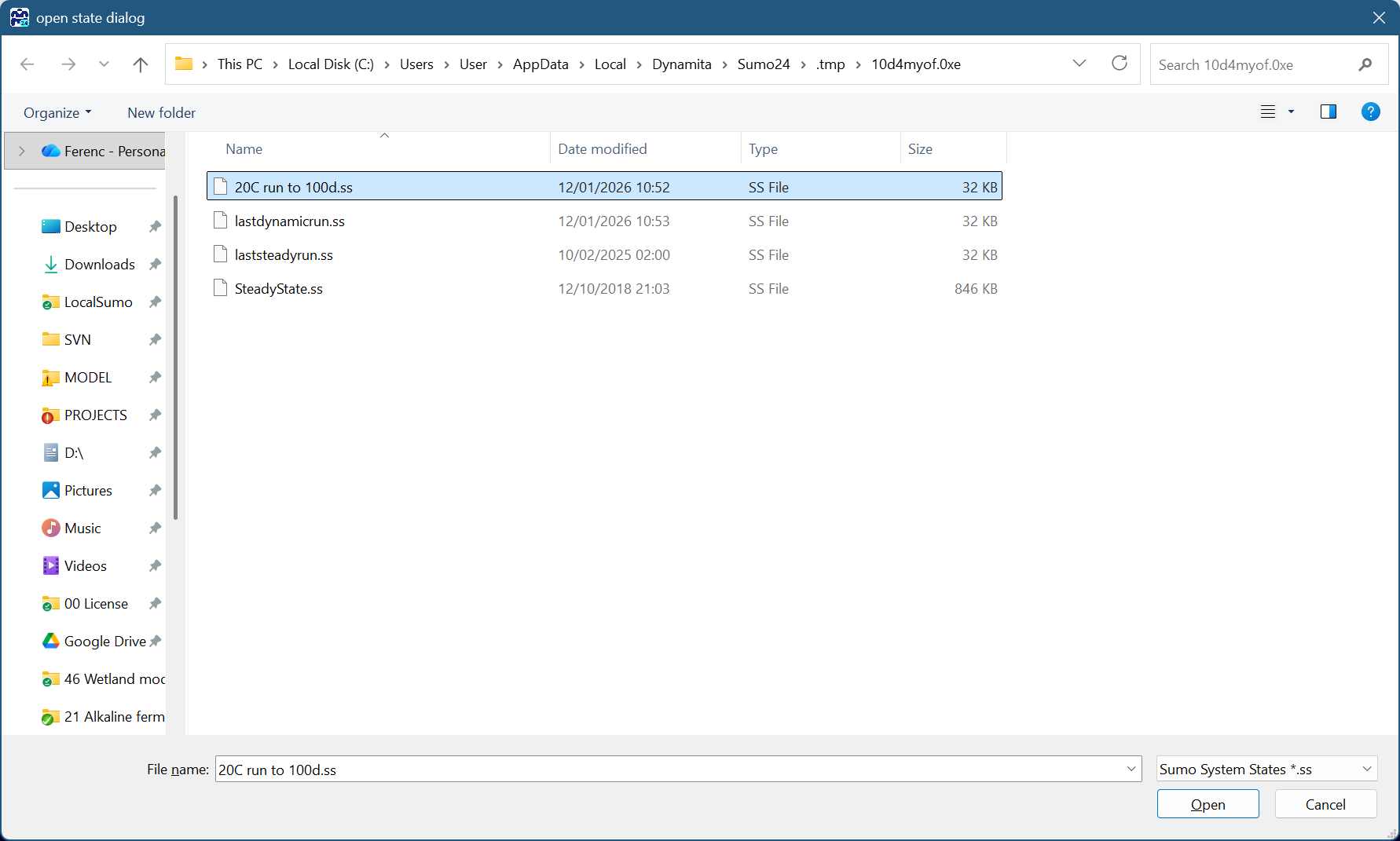
6. An open file dialog opens up in the project folder and if the saved condition is there, it can opened directly. Simply select the relevant file and click Open:
7. Sumo will ask if you're sure to overwrite all initial conditions of the plant. Remember that every process units state gets to the result of the saved simulation:
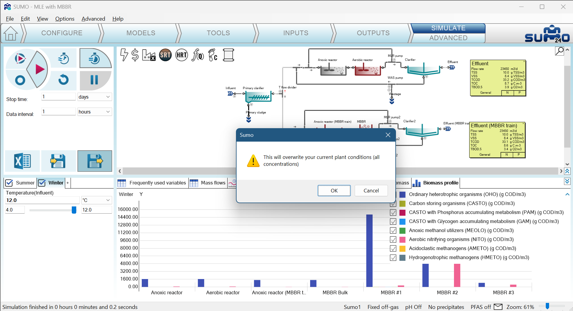
8. Start the new simulation from the loaded conditions.
NOTE: What happens with modified layouts?
Sumo will load the conditions for the original part only, thus partially load the conditions. The saved states are stored only for units being part of the project at the time of the generation of the saved conditions. In case of missing units a message will be shown for them.
¶ Clarifier State Point Analysis
A State Point Analysis (SPA) diagram is a graphical tool used to evaluate the settling characteristics and performance of a clarifier in a wastewater treatment system. The diagram plots the operating line, which represents the relationship between flow and solids flux in the clarifier, against the solids flux curve, which represents the capacity of the sludge to settle under specific conditions. The intersection of these lines determines the state point, indicating the operating conditions of the clarifier. This analysis helps identify whether the system operates under conditions that ensure effective solids-liquid separation, avoiding issues like overloading, which can lead to poor effluent quality. Additionally, state point analysis can assess the impact of changes in flow rate, sludge concentration, or solids loading, aiding in optimization and troubleshooting of the clarifier's performance.
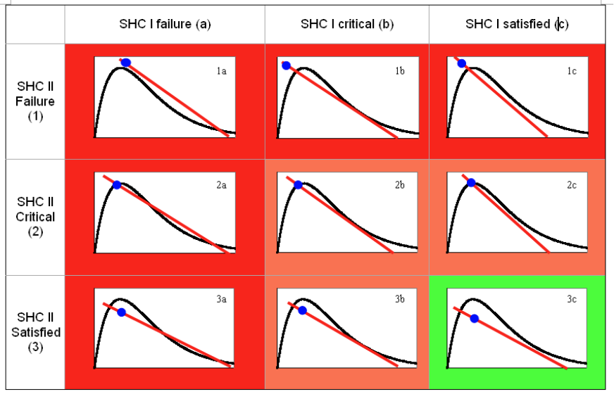
In order to interpret the SPA chart, it needs to be evaluated against two Solids Handling Criteria (SHC):
- SHC I (underflow condition)
if the underflow line happens to fall outside of the flux curve, we cannot get the solids out from the clarifier (settling is insufficient) - SHC II (feed load condition)
if the state point happens to fall outside of the flux curve, the load in the feed layer is more than what the clarifier can handle at that point (so it goes up eventually, as the clarifier is overloaded).
Compilance to the above criteria on an SPA diagram are depicted on Figure 3.6.1.
¶ Date and time based dynamic input
This is a feature requires a different setup for the first column of a dynamic input table. The overall logic is similar:
- Set up import data structure
- Copy data
- Paste to SUMO
- Set specification
- Run simulation
The crucial points are the first and fifth.
¶ Set up data structure
To set up data structure, the date and time format of the dataset should be known. SUMO works with various date and time formats, for the possible combinations visit the following site:
https://learn.microsoft.com/en-us/dotnet/standard/base-types/custom-date-and-time-format-strings
Note: ‘date’ can be used in the second row of the DateTime column. In that case check the imported data to confirm the correct format was recognized.
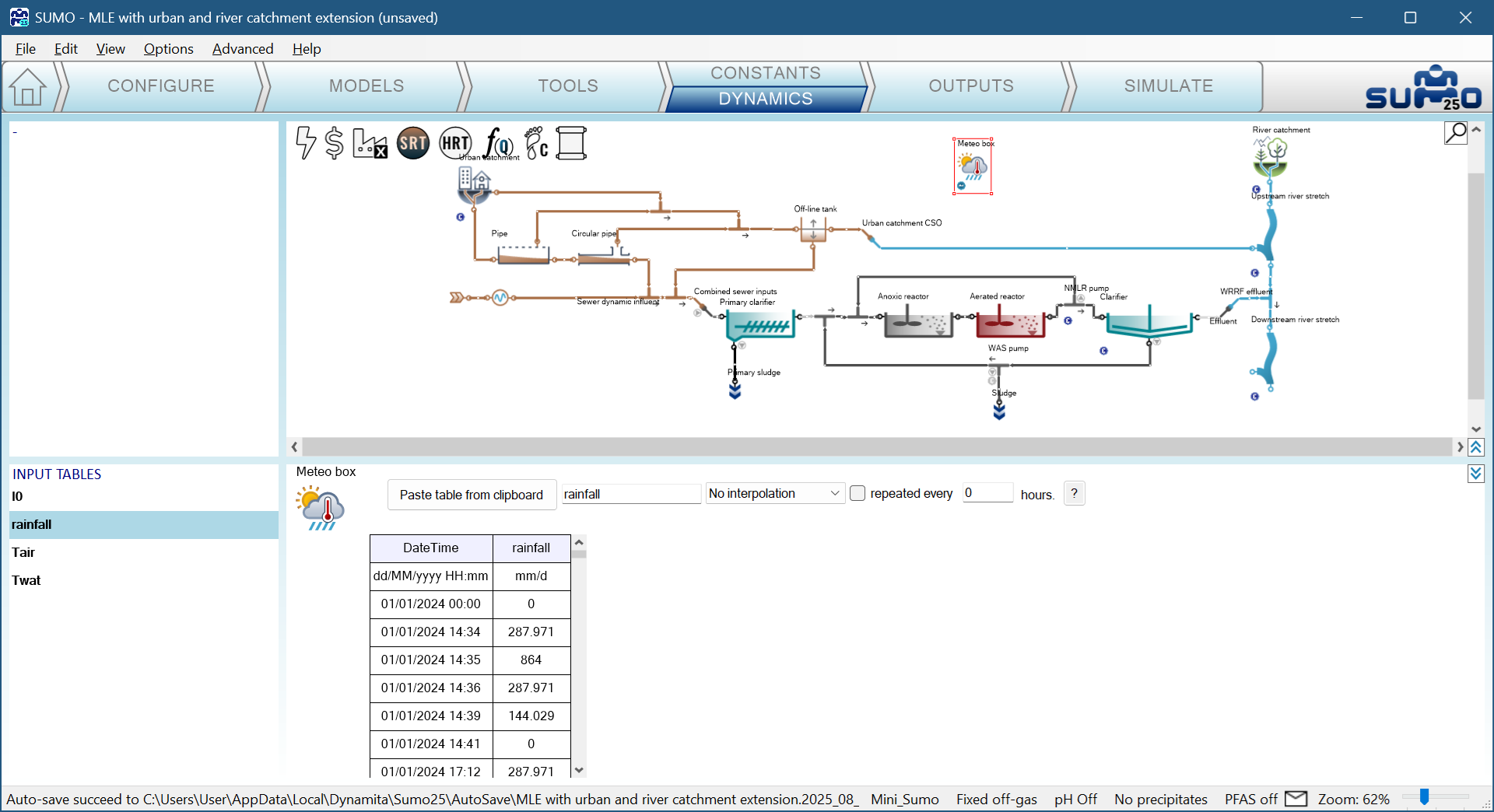
The example is based on the MLE with urban and river catchment extension and walks through how the meteo data was added to the model for the year of 2024.
The data was cleaned from outliers and the Meteo data.xlsx file was prepared with proper table headers.
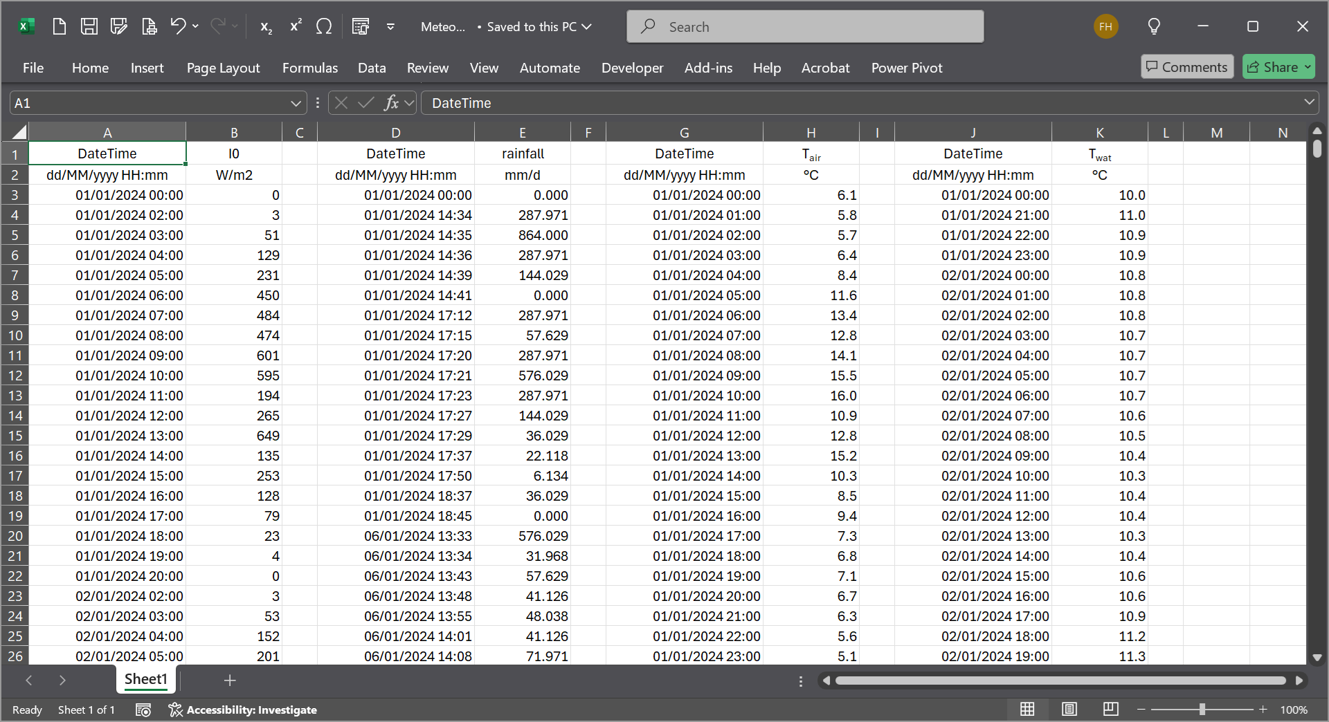
Note the first column changes:
- DateTime is used instead of Time
- full date and time format given
- the date and time is formatted as given in row two
- as the data is not taken the same time, thus separate columns were prepared for different inputs (with special tools these can be merged and SUMO can handle it in one table)
Copy and paste the data into SUMO for all four parameters.
¶ Run simulation with date based dynamic input
|
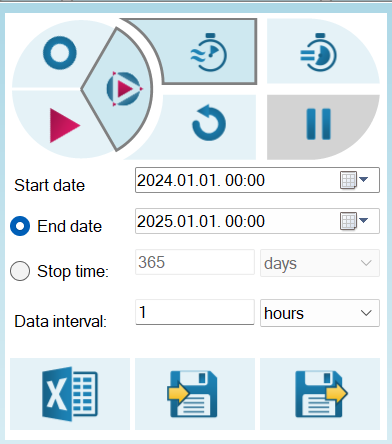
By adding a single set of Date and time based dynamic input to the simulation, the Simulation panel at the Simulate tab will change to allow the selection of date based dynamic runs.
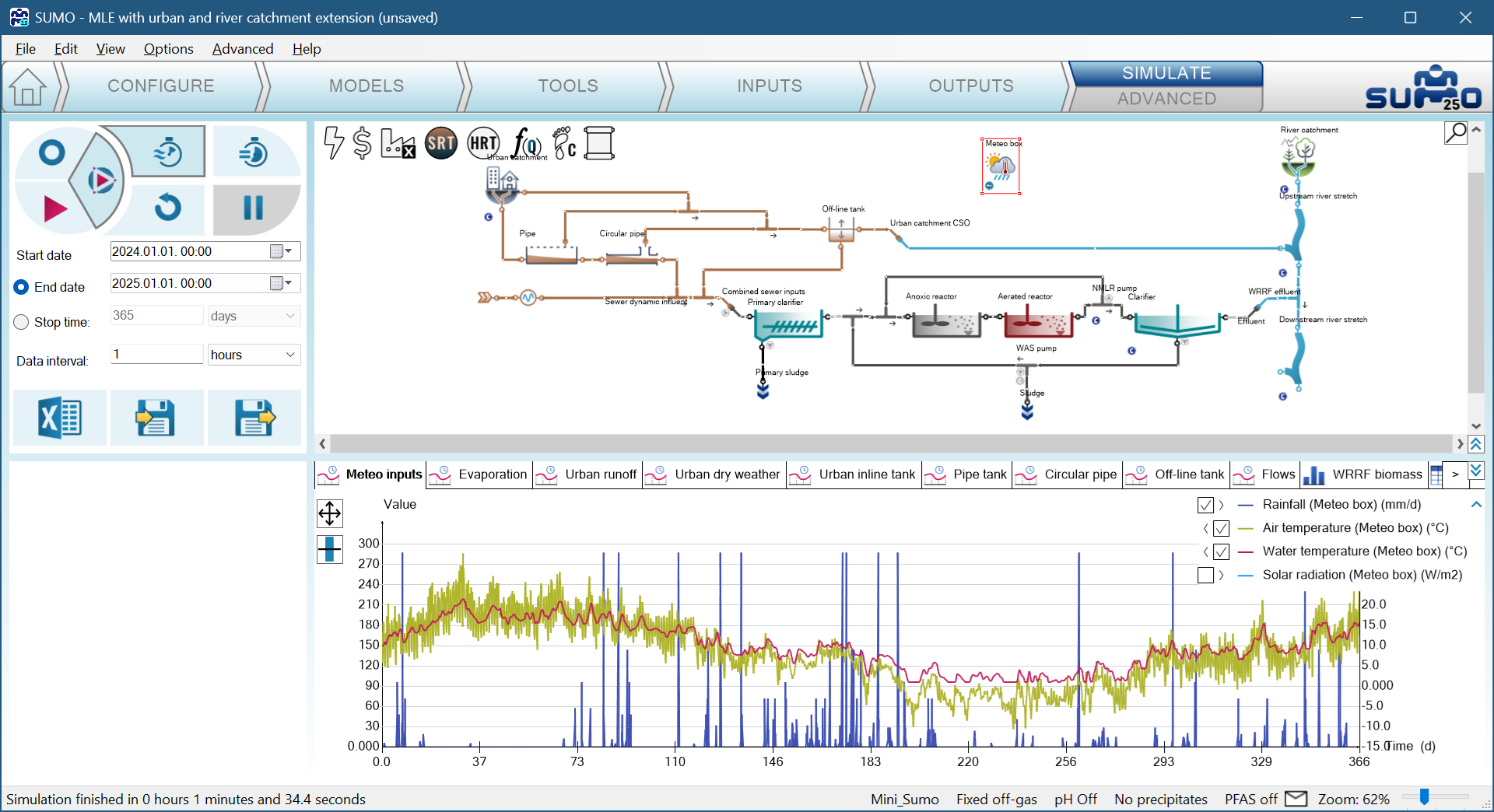
The Steady-state run is not changed as it is based in the constant inputs. With date and time based dynamic input the start time of the simulation has to be selected. In this example, the imported one year data covers the year of 2024, thus the settings are highlighted to cover that. Additionally, instead of the End date definitions the Stop time can be selected to define the simulation duration - depending on the desire of the user.
Figure 3.8.2 shows the inputs of the one year simulation for air and water temperature (right Y axis) and the rainfall.
The date based dynamic input brings the possibility to run the simulation on a defined period of the dynamic data as shown on Figure 3.8.3.
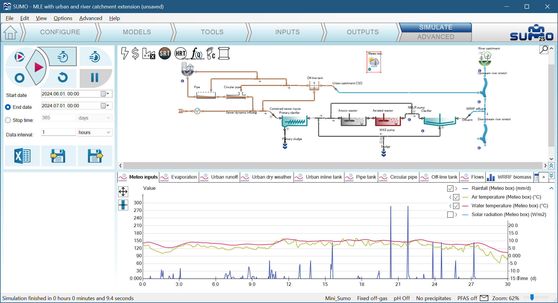
Note: Date and time based dynamic input all the process unit is not required but strongly recommended. A simple dynamic input always will start from day zero - thus misalignment of date and time is possible if non-date-based dynamic tables are used in the layout.
¶ Next chapters
Chapter 4 – Controllers
Chapter 5 – Energy and Cost calculations
Chapter 6 – Carbon footprint assessment
Chapter 7 – Design model
Chapter 8 – Examples